Did you know, that Moda is coming up with a new product: a fat quarter bundle of 12 assorted solids in the very popular high fiber quality Moda is known for.
![]() |
| Zen Chic Bella Designer Select |
I hope you enjoy this gorgeous new product as much as I do!
![]() |
| Zen Chic Bella Designer Select |
…they finally arrived. This morning the UPS guy rang at my door and had a huge express package for me. My fabrics are here! How I love them! How I love what Moda made from my designs. They added black and the Labyrinth print and all together looks so good to my eyes (you can enlarge the picture by clicking on it). I’m really thrilled to touch them and to work with them and to sew wonderful things.
And now I can’t wait to start sewing…
…sie sind endlich hier!Heute morgen um klingelte UPS an meiner Tür und hatte ein riesiges Expresspaket für mich. Meine Stoffe sind da. Und wie toll sie geworden sind, ich bin beeindruckt, was Moda aus meinen Designs gemacht hat. Sie haben schwarz mit in die Kollektion genommen und einen Druckstoff aus dem Labyrinthquilt entwickelt (man sieht es noch besser, wenn man auf das Bild klickt, um es zu vergrößern). Und alles zusammen sieht in meinen Augen wirklich wunderschön aus. Ich freue mich riesig an den Stoffen, sie anzufassen, mit ihnen zu arbeiten und schöne Dinge damit zu nähen.
Ich kann es nicht erwarten, damit anzufangen…
This time I found it not easy to find the perfect royal or jeans blues to match my color palette of the last post.
I’m not really in love with the fact that the brown fabric in the first row doesn’t connect better with the blues. Ok, I’ll accept to be not perfect ;-)
It’s from left to right
1. Mini Brush Indigo by Hofman
2. Dandelion Daydream from Maywood Studios
3. Essential dots royal by Moda
4. Seuss Eggs Blue by Robert Kaufman
5. Bugz from unknown
6. Daisies & Dots for Robert Kaufman
7. Violet Maze by Timeless Treasures
8. Dilly Dally Big Dots Sky Blue by Me and My Sister for Moda
9. Fuzzy Tail Puppies Bones from South Sea Imports
The red eggs are really eye-catching, aren’t they?
Dieses mal fand ich es gar nicht so einfach, die perfekten Stoffe in tinten- und jeansblau zu finden, um die Farbpalette aus meinem letzten Beitrag zu treffen
Und ich bin auch nicht wirklich glücklich damit, dass das Braun in der ersten Reihe sich nicht so einfach mit dem Blau verbindet, aber gut – es muss ja auch nicht immer alles perfekt sein.
Die fetten roten Punkte sind wirklich ein Blickfang, nicht wahr?
This spring flower bouquet of my last post demands for something light, flowery, swirly – I think we get a more basic palette with small scale prints and little dots. The very right thing for a little girl.
It’s from left to right
1. Puttin On The Ritz by Anne Sutton for Moda
2. Han e mai by RJR Fabrics
3. White Polka Dots on Mint Green
4. Bear Essentials by P&B Textiles
5. Dot green
6. Pale Pink Linen Texture by P&B Textiles
7. Curlicue Pink by Jane Sassamann for Free Spirit
8. Houndstooth Pink Sorbet by Chez Moi for Moda
9. Leafy swirls Pink Sorbet by Chez Moi for Moda
Whom do you think would you sew such a spring quilt? Do you have anyone in mind who would love these colors? Please let me know…
BTW: although I’m not such a girly type I love to wear a pale pink blouse, it’s just such a fresh feeling.
Dieses frühlingshafte Blumenbouquet aus meinem letzten post verlangt doch einfach nach etwas leichtem, blumigem, verspieltendem – ich denke es braucht hier eine ganz schlichte Basispalette, kleingemusterte Stöffchen, Punkte. Gerade das richtige, wenn man ein Mädchen denkt.
Wem würdest du denn solch einen Quilt nähen? Hast du irgendjemand im Sinn, der/die diese Farben lieben würde? Erzähl mal, bitte.
Übrigens bin ich ja selbst gar nicht so ein Girly-Typ, aber ich liebe es, eine rosefarbene Bluse zu tragen, es fühlt sich so nach Frische an.
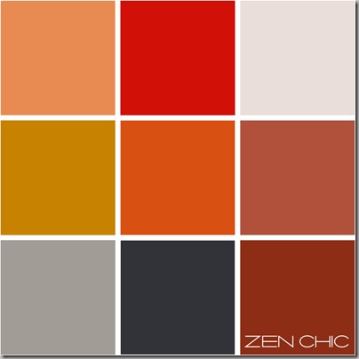
My last color choice was more decent, way of cool – so my today’s color scheme demands for something vibrant, warm.
If you wonder what that flickr photo might be about -
found from cobalt123 via flickr
it’s a macro shot of a lot of nursery bedding pots in the hothouse ready for the next season of early planting. Would you have guessed?
Cool, huh? Well, I mean hot, or warm, or kind of cozy although it could also be rusty steel, something like that.
So, now my color palette
I just can help but thinking of a crackling open fire, me in front of it, reading an exciting book.
What do you imagine seeing those colors? What inspirations do they give to you?
Mein letztes Farbschema war dezent und etwas kühl, deshalb war mir dieses mal auf jeden Fall nach etwas Warmem, Farben mit Ausstrahlung. Falls du dich wunderst, was auf das auf dem Foto (bei Flickr gefunden) sein soll – es sind zusammengestapelte Blumentöpfe in einem Gewächshaus, die auf die neue Pflanzsaison warten. Cool, oder?
Nein, ich meine eigentlich eher warm, heiß, und auch irgendwie gemütlich. Die Farben könnten auch von einem Stahlrohr mit Rost sein oder so etwas ähnlichem.
Bei diesen Farben steigt in mir sofort ein inneres Bild von einem prasselnden Kaminfeuer auf, ich sitze (nein chille sagt man ja heute) davor, und lese ein spannendes Buch.
Was denkst du bei diesen Farben, welche Bilder oder Inspirationen verbindest du mit diesem rot?
Someone drew my attention in the last comments to the fatquartershop competition explained at quokka quilts and yes – I do my fabric selection for this nice activity. That means you can get all the fabrics I’ve chosen in only one shop, at fatquartershop.
Why not go there and try your own version?
See mine
Die Stoffe, die ich diesesmal ausgesucht habe, kann man allesamt in einem Shop bekommen, bei Fatquartershop.
These are the modern green fabric’s I’ve chosen to match the below palette. Let’s see which quilt pattern I can get out of those. BTW there are so much pleasing graphic prints on the market, which new fabric line is your favorite and why?
Last Tuesday I had this bunch of luggage in such vibrant shades of turquoise, forest, mint, gold and grey as my inspiration for a color scheme.
Letzten Dienstag stand das Bild mit dem üppigen Gepäck in Jade, Tannengrün, Türkis, Grau und Gold Pate für mein Farbschema in Grün. Und dies sind nun die modernen, graphischen Stoffe, die ich ausgesucht habe, um diesem Farbschema zu entsprechen. Mal sehen, welches Quiltmuster ich dann bis nächste Woche daraus machen kann. Übrigens gibt es ja so viele tolle graphische Stoffdrucke, gerade sind wieder eine Menge neuer herausgekommen.
Welches ist deine Lieblingskollektion und weshalb?
Last week my post about color choices for the modern quilter had this inspirational picture of a wall of exfoliated surfaces (actually this wall was not at all modern, so to say). Out of your comments I got the idea to reflect this mottling by similar looking fabrics. And although I have ever loved a good example quilt made of them I personally tend to leave them in their shelves, just walking by, waving a nice hello and seeking for graphic prints. Buuuttt in this case, they were my perfect choice.
What do you think, don’t Batiks simply reflect this walls surfaces wonderful?
All fabrics are from Batik Textiles, from left to right
Nr. 1207, 1262, 5152
Nr. 1006, 112, 1243
Nr. 1615, 1608, 102
For me this fabric palette doesn’t stand for a typical “modern palette”, I think you can use it for a traditional quilt also. But wait what I have made out of it… That’s not at all traditional. Tune in next week.
BTW: Don’t miss your chance to get a Sweetwater Christmas fabric pack. You can still submit a picture of your pillow until 25th of this month. Go here
Mein Post von letzter Woche über Color Choices for the modern quilter hatte als Inspiration ein Foto einer total abgeblätterten Hauswand. Und die Kommentare, die ich bekommen hab, haben mich dazu angeregt, diese fleckige Struktur in ähnlich fleckigen Stoffen aufzugreifen.
Obwohl ich immer gute Beispiele von Quilts aus diesen Stoffen bewundere, tendiere ich selbst dazu, sie lieber im Regal stehen zu lassen und ihnen ein freundliches Hallo zuzuwinken, während ich lieber nach graphischen Drucken Ausschau halte. Aber in diesem Fall waren Batiks die perfekte Wahl. Geben Sie nicht ganz wunderbar die malerischen Wände wieder? Was meinst du zu Batiks?
Diese Stoffpalette zählt für mich eigentlich nicht unbedingt typischerweise in die Kategorie “modern”, sie ist eher zeitlos und könnte genausogut in einem traditionellen Quilt Anwendung finden. Aber warte mal ab, was ich weiter damit angestellt habe. Nächste Woche zeige ich ein Muster, und das ist ganz bestimmt nicht traditionell.
Übrigens, vergiss nicht, dass es ein tolles Stoffpaket zu ergattern gibt, falls du ein Kissen parat hast, dann verlinke es noch schnell in diesem Monat, du hast noch bis zum 25. Zeit. Hier gehts zum Pillow Talk.
Lots of you let me know they are curious what will become from the masculine color scheme I posted last week. By the way: thank you so much for saying that you like this post series, it was uplifting and encouraging to get this feedback!
So these are the modern fabrics I’ve found to match my scheme.
I especially love the eye-catching dotted Moda fabric (third row).
What’s your favorite fabric from this scheme and where do you find your modern prints?
Bei meinem “maskulinen” Farbschema von letzter Woche gab es einige, die mir geschrieben haben: Ich bin gespannt, was für ein Muster daraus wird. Das Muster gibt es nächste Woche, doch heute erst mal eine passende Stoffauswahl, von denen mir der rechts in der dritten Reihe (Nr.6) mit seinen attraktiven Punkten besonders gut gefällt.
Was ist dein Lieblingsstoff aus diesem Sortiment und wo kaufst du am liebsten moderne Drucke?
(I can't resist dots. They always add some kind of fun to a quilt).
It's (from left to right)