I often like to use an impressing picture for example of a landscape
 and take the most important colors as a guide for my quilt design. Here I could use a very popular color scheme from darkest blue to white
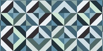
 which colors my design like this
I think it's not too bad, but the colors are very pure. May be a good effect (think of Japanese indigo quilts), but could be also a little bit boring. So my second try will be to look for more nuances. In the picture I saw greens and browns too.
 This wider range looks livelier.
Well, I like this one better, but best I like to add a very little pinch of exotic spice, means a contrasting color like a warm red in these cool blues.

That will do.


3 Kommentare:
I saw your comment on Bonnie's blog and came by for a visit.
That is a very intersting color exercise. I like the final combination best with the bits of contrast scattered through the quilt.
Siobhan
Hi Brigitte,
I like these too, and your tulip color exercise. You have a good eye. Nice start to your blog.
I live in Hamburg. What city do you live in? I don't really know any quilters in Germany, except one American friend.
Nettie
P.S. I made a scrappier quilt like this, with a navy background. You can see it on my blog.
Here's a link, since i'm not sure if it's easy to find (I'm also new to blogging)
http://quiltingbear.blogspot.com/2007/02/this-is-quilt-i-made-for-dirt-friendly.html
Kommentar veröffentlichen